Is The Newest The Best? Every Modern Era Doctor Who TARDIS Interior Ranked

Will you agree with our ranking?
The new special episode, The Star Beast, kicked off the new era of Doctor Who with the return of some familiar beloved faces. Russell T. Davies returned to the showrunner's chair and David Tennant reprised his role as the charming Time Lord, this time as the Fourteenth Doctor.
The new Doctor means a new TARDIS design, and the show didn't take long to introduce the new interior that will be the setting for the Doctor's adventures for the foreseeable future.
How does the new design compare with other modern TARDIS interiors? Here we provide a definitive ranking with commentary. Let's see if you agree.
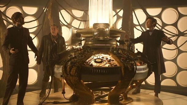
7. The War Doctor

John Hurt's War Doctor was first introduced in Season 7 of the Modern Era and didn't have too many appearances. That's probably why the design of his TARDIS didn't grow on viewers.
While it is functional and works well for the character, it feels a bit empty with the classic white polka-dot walls. The console and coral frames are a nice touch, but too similar to the Ninth/Tenth design. Also, the step under the console looks very impractical and even dangerous.
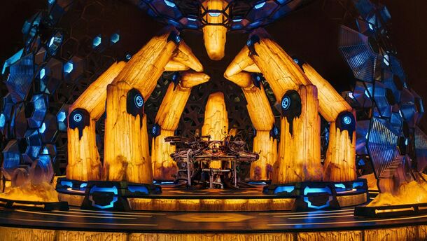
6. The Thirteenth Doctor

Jodie Whittaker's era changed a lot about the Doctor's designs and her TARDIS was definitely the most creative. The yellow and blue crystal theme is refreshing for Doctor Who, but it is quite cliché for an alien vibe in general.
Also, the whole place is too dark. Even the Doctor herself doesn't spend much time there.
5. The Eleventh Doctor (2nd Design)
.jpg)
Matt Smith is the only actor to have had two TARDIS designs during his tenure as Doctor Who. The second one came in the middle of Season 7, after the Doctor parted ways with the Ponds.
The grief over the loss of the beloved companions is reflected in the design, as it lacks some personality and feels cold, empty and uninviting. But the layout is simply perfect and a golden TARDIS standard.
4. The Twelfth Doctor
(1).jpg)
The Peter Capaldi era TARDIS has the same amazing layout and basic structure as the second Eleventh. But it adds personality in the form of decor, furniture and warm lighting.
With the steam-punk undertones going on, this interior fits the Twelfth Doctor perfectly, making it a favorite for many viewers.
3. The Fourteenth Doctor
.jpg)
Here we are. The new TARDIS design introduced in The Star Beast is, in our opinion, in the top 3 of modern era interiors. It is certainly the most spacious of all, and really delivers on the 'bigger on the inside' line, giving David Tennant plenty of opportunities to run around frantically pulling switches and levers.
It is clean and futuristic, with a nice nod to the classic interior in the form of illuminated roundels on the walls. And it has a coffee maker. But it is also empty and too bright with the white and gray color scheme. And when the colors change, it has a disco effect that is a bit confusing.
2. The Ninth/Tenth Doctor
.jpg)
During his first tenure, David Tennant inherited Christopher Eccleston's TARDIS interior and rocked it for his entire run as Doctor Who. For the majority of fans, this interior is a symbol of the modern era that can't be replaced.
Although the console room was often messy and unkempt, it always felt warm and inviting with its iconic coral frames and magical earthy look. The only flaw that could be mentioned is the lack of homey details.
1. The Eleventh Doctor (1st Design)
.jpg)
It's almost impossible to pick a favorite, but we just couldn't put anything above this one. Matt Smith's first design combines the creativity and nostalgic warmth of its predecessor with the whimsical tiered floor plan of its successor.
With its many staircases, corridors, glass panels, different-sized buttons and roundels, the interior is a mix of steam-punk and fairy tale, straight out of Willy Wonka's Factory or Alice in Wonderland.